
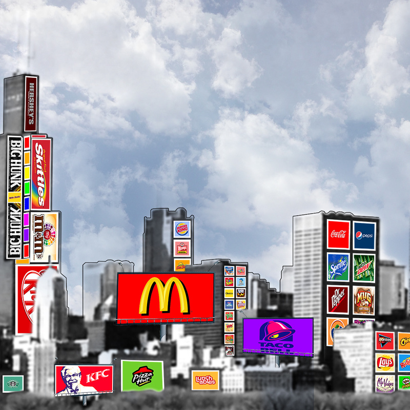
Food Industry Advertisement Poster
This poster was done in part with my food essay from Humanities looking at how companies target consumers through advertisements, and how this may cause unhealthy eating habits for people of all ages living in America's modern food culture. I used Photoshop CS6 for this project, and I feel like this poster in specific helped me learn how to keep my work organized because I had to work with many different layers while making this piece.
Food Poster Reflection
I chose to create a poster in Photoshop CS6 because I was already familiar with the program from all of the practice we had had with it in previous assignments and projects. Being familiar with Photoshop, I was able to manage my time very well and assess how long it would take me to create different parts of the poster. Photoshop also seemed like the obvious choice because I wanted to combine multiple layers easily and it seemed like it would be easiest in this program. Because of all the Photoshop brushes available for download online, creating a city scape like the one I envisioned in my original sketch was very simple, and looked good in the final product. Through Photoshop, I was able to create a poster like the one I originally envisioned, and I felt comfortable making it in a program I had come to learn and know very well.
I was able to get my point across using color, emphasis, and rhythm. Because most companies have large colorful logos, I felt that color was going to be an essential part of my project from the beginning, and its use helped me create a more unified poster. To exaggerate the amount of advertisements we see on a daily basis, I tried to emphasize on the logos on the poster by making the city behind them bland and grey while they themselves were bright and colorful. Lastly, I tried to give the viewers a sense of commotion and steady movement by placing the posters on the page in a rhythmic pattern. By using all of these elements and principles, I was able to successfully get my point across. I was able to show that we are constantly surrounded by advertisements, and even though we may not know it, they are popping out at us all the time.
If I were to do this whole process over again, I would have given a little bit more thought to my overall project idea. When we began this whole process, I had this "grand idea" of what I thought would be a nice representative piece for my project. Unfortunately, I quickly found out that the original idea I had was not going to be as easy as I had originally thought, and so I detoured to a "plan b" project. When I sketched out this project, I knew it wasn't going to be nearly as good as the one I had originally envisioned, but I was running out of time and I wanted to get working so I had enough time to complete the project. If this happens again in the future, I'm just going to slow down and take a minute to re-focus my project so that I can have the final product I originally envisioned and strived for.
Click Here To Read Full Food Essay
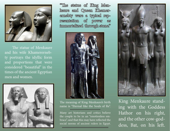
Pre-historic Art Brochure: Menkaure and Khamerernebty
In this project we used Adobe InDesign for the first time, and we learned how to create unique and interesting brochures digitally. I had a lot of fun with this project because I was able to combine pictures of the statue of Menkaure and Khamerernebty with creative text to create a well balanced project.
Pre-Historic Animal Drawing
For this part of our art history project, we were instructed to draw a pre-historic animal in our sketch books, and so I drew a sloth meditating. After we drew the animals, we scanned them into our computers, and then we imported our sketches into Adobe Photoshop and Illustrator to refine them more and play around with different thresholds and tracings. During this project I learned a lot about different sketch styles and how to "digitalize" art.
